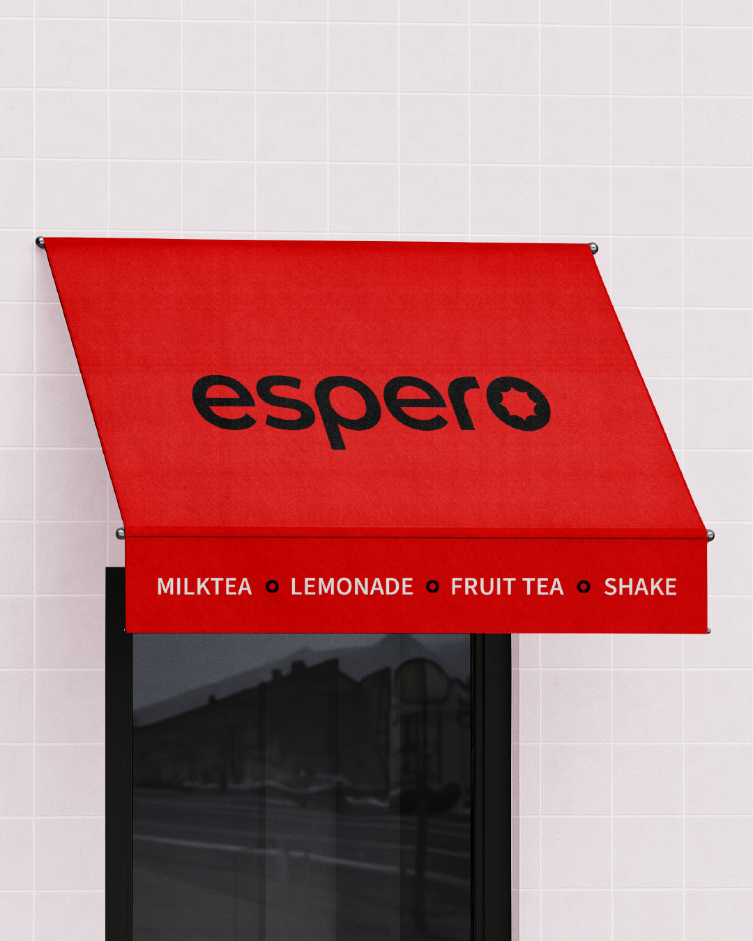
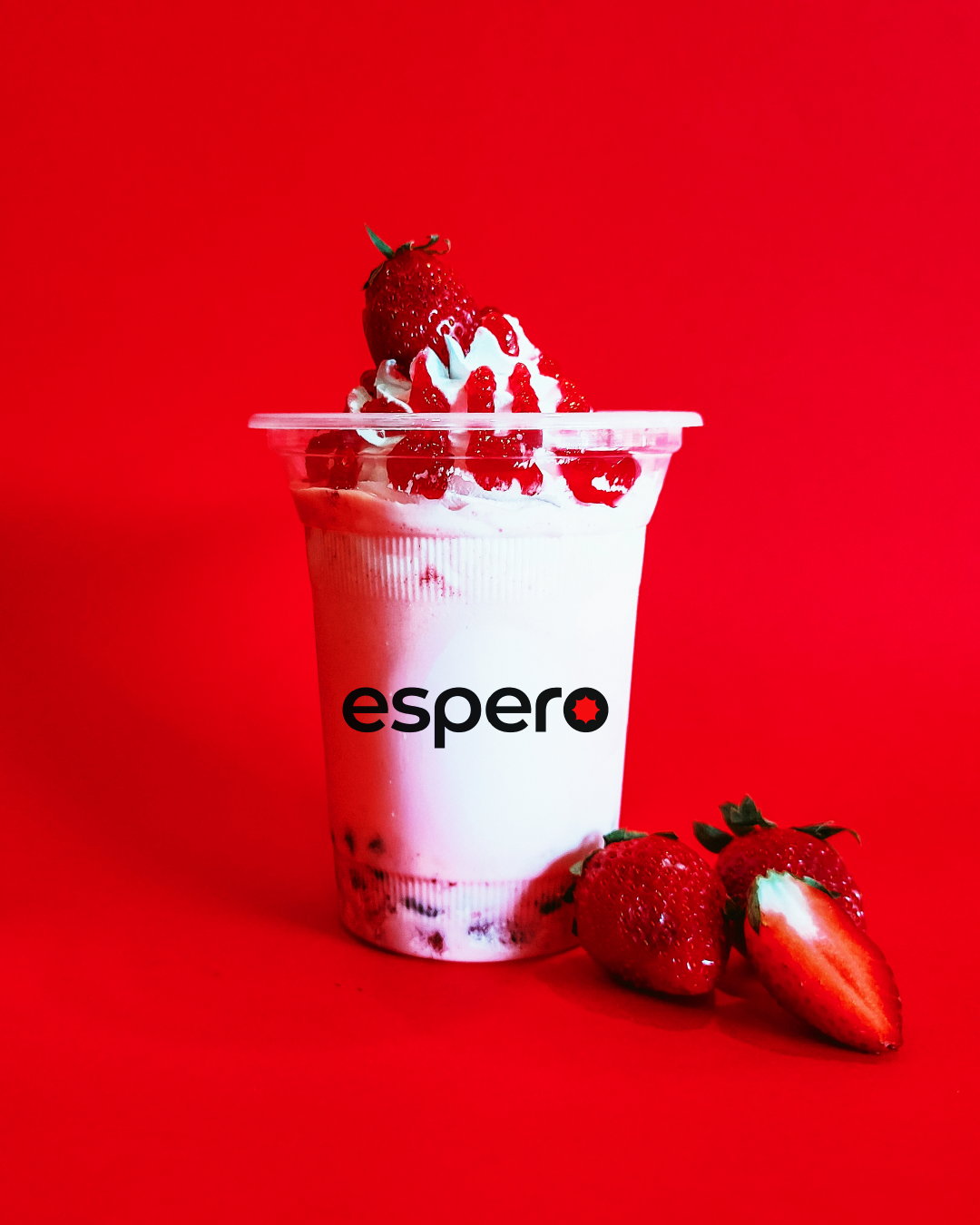
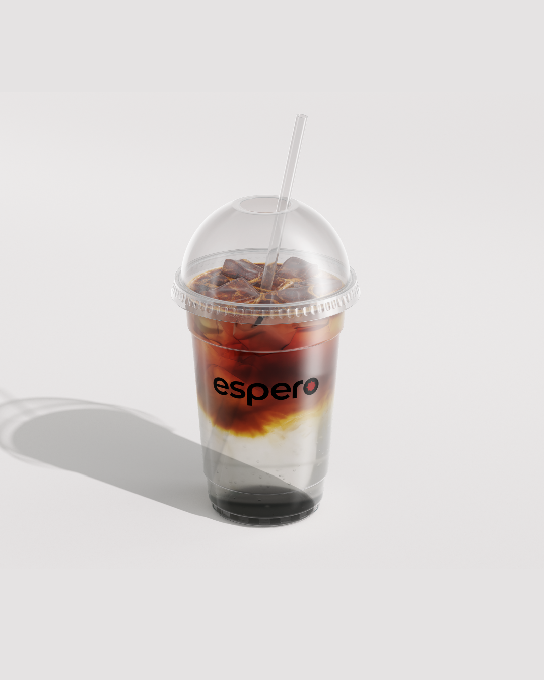
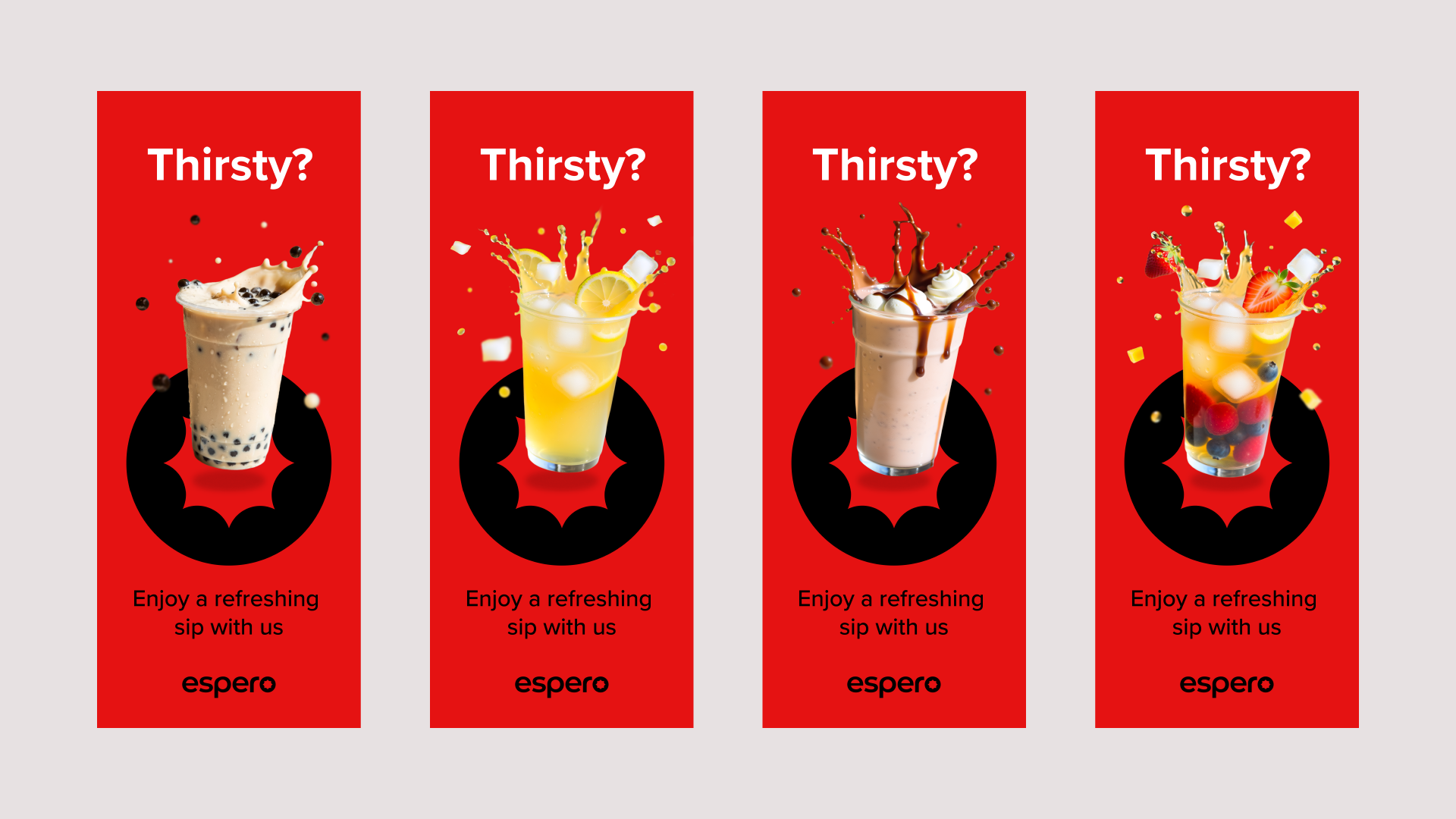
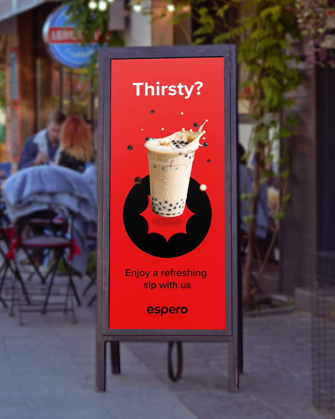
Espero is a small but spirited F&B brand that brings joy to its customers through refreshing drinks such as milktea, milkshakes, fruit teas, and lemonades. Their vision is simple: to create beverages that feel as delightful and shareable as the moments they accompany. As they looked to strengthen their identity, they faced a challenge since their old logo bore a striking resemblance to one of their major competitors, limiting their ability to stand out.
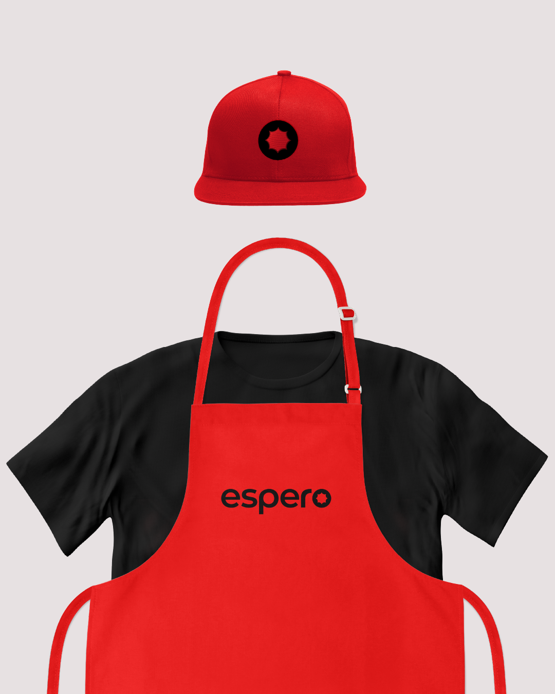
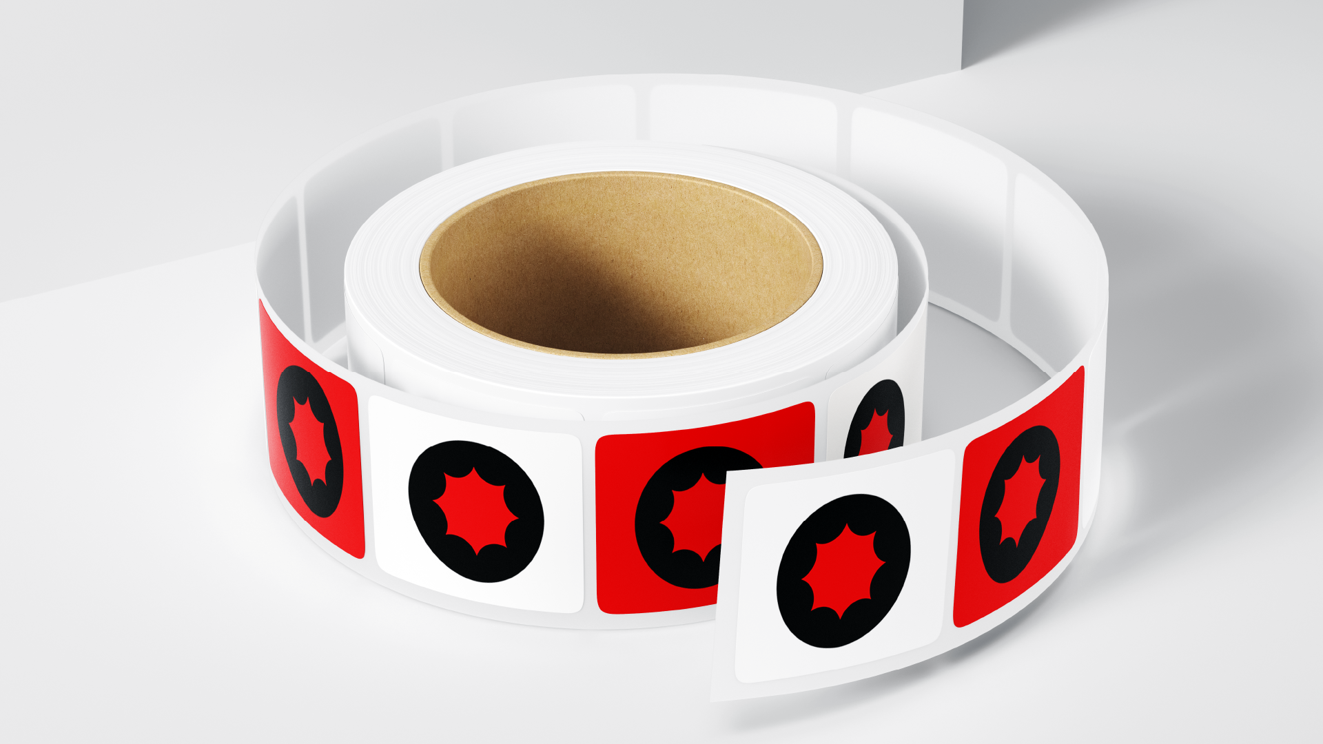
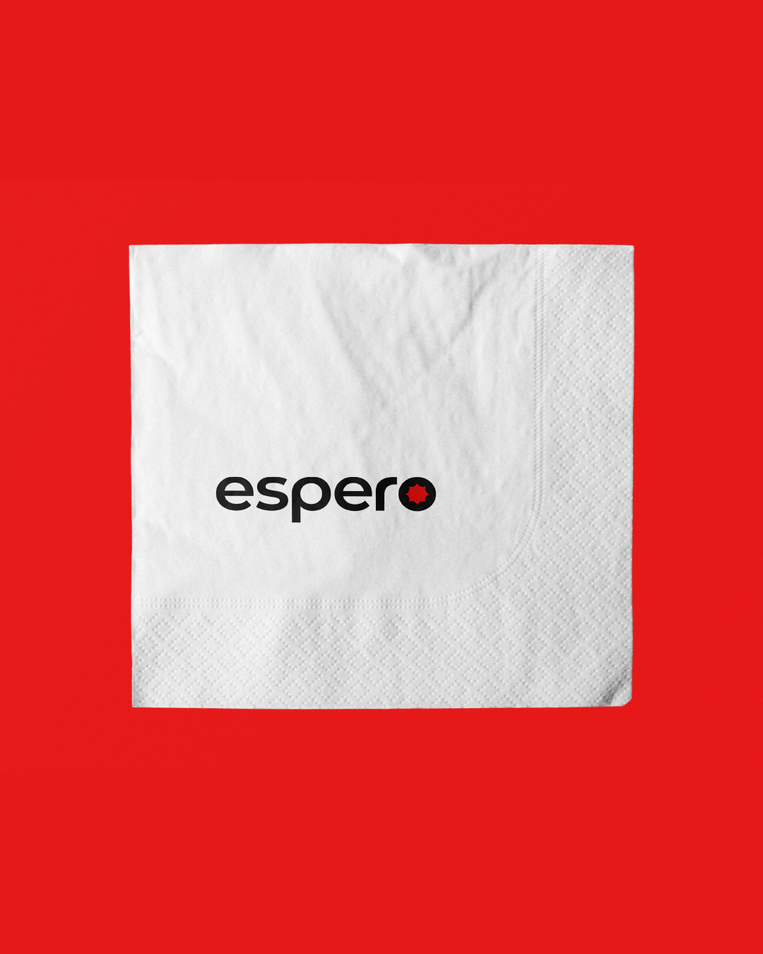
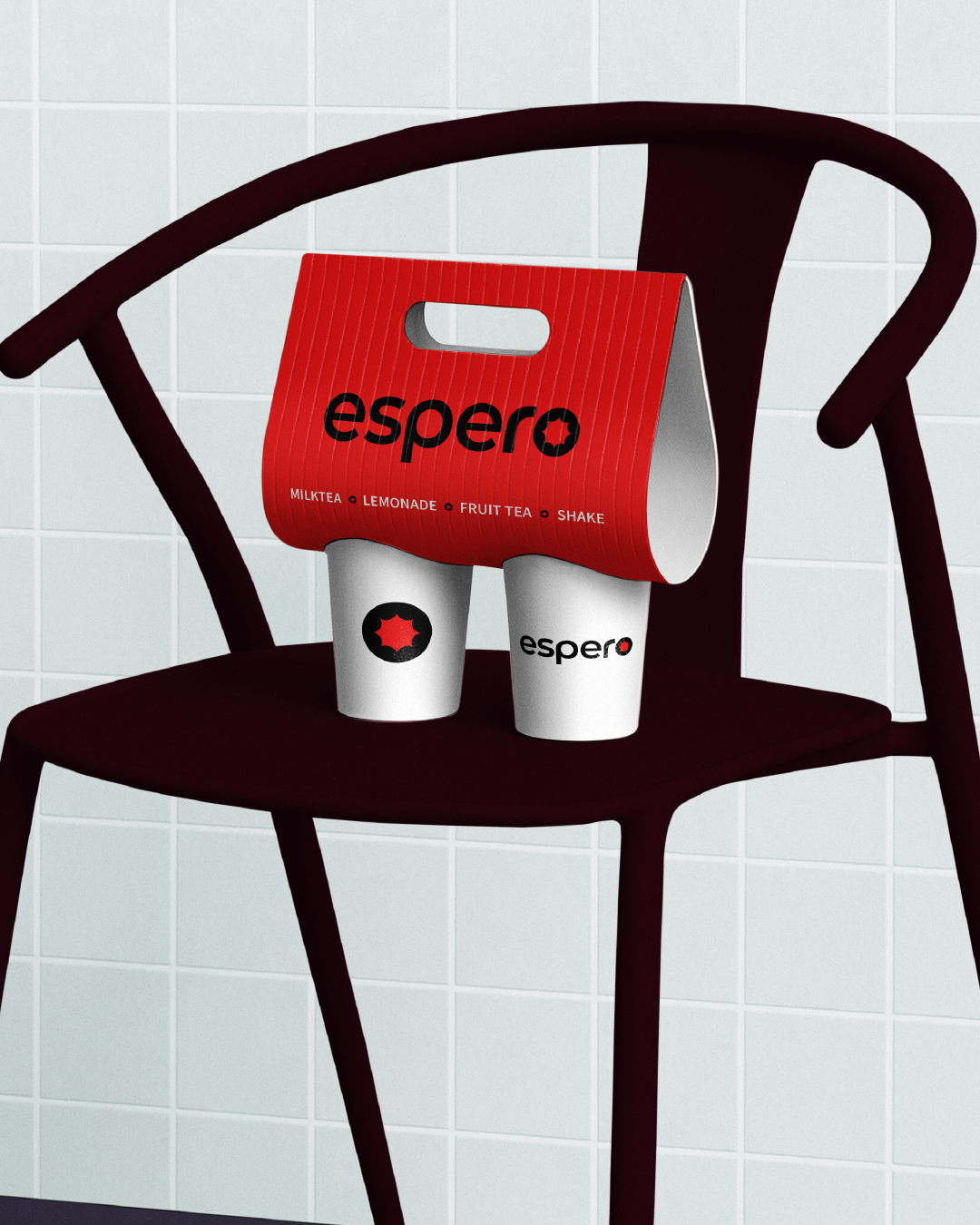
To help them carve their own space, I refreshed their brand identity with a new icon that is abstract, modern, and versatile. Designed to resonate with young audiences and thrive in the digital age, the new mark is playful yet sophisticated, crafted to be instantly recognizable and highly “instagrammable.”